Visualizations
🚲 Visualization Gallery
This page presents visualizations from the case study. Visuals are grouped into thematic sections covering time-based patterns, temperature effects, spatial behavior, and more.
📈 Interactive Visuals
🚴 Top Stations Map (Leaflet)
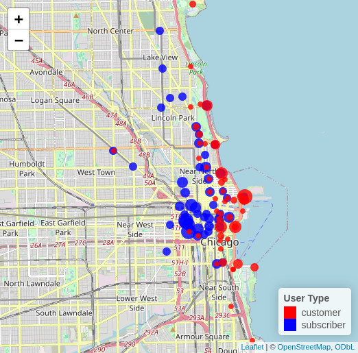
This interactive map of the top 50 stations includes the top 50 stations by number of subscriber rides and the top 50 stations by number of customer rides. We break from the normal color scheme as more contrast was required due to the preexisting colors in the map. So the dots for subscriber stations rendered in blue and the dots for customer stations rendered in red. The dots for stations are offset slightly to avoid one dot obscuring the other for the cases where the station is in the top 50 for both subscribers and customers. This is accomplished by using a data frame where the location of the stations is offset. The size of the dots is scaled by the total number of rides (subscriber or customer as appropriate), so that stations with more rides are larger dots.
It was created in R using Leaflet.
Tableau Sheets
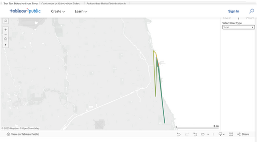
Sheet 1: Top 10 Rides by User Type (Map View)
This interactive map displays the top 10 most common ride paths (station-to-station pairs) for a selected user group: All Riders, Subscribers, or Customers.
- Each line represents a frequently traveled path, regardless of direction.
- Line color corresponds to ride volume between those stations.
- Users can filter by rider type using the control panel on the right.
This visualization highlights differences in spatial behavior between groups:
- Customers tend to use routes near the lakefront and popular tourist zones.
- Subscribers favor more distributed, commuter-oriented paths.
“Station usage differs substantially by rider type, bu not in the expected way.”
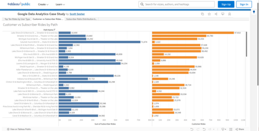
Sheet 2: Customer vs Subscriber Rides by Path (Histogram)
This histogram compares ride volumes for station-to-station pairs with at least 10,000 rides, of which there are 88, sorted by total combined ride count.
Each bar shows the ride count split between Subscribers (dark blue) and Customers (orange) for a specific path.
This view emphasizes which ride paths are dominated by Subscribers (often commuter routes) versus those with more balanced or Customer-heavy traffic.
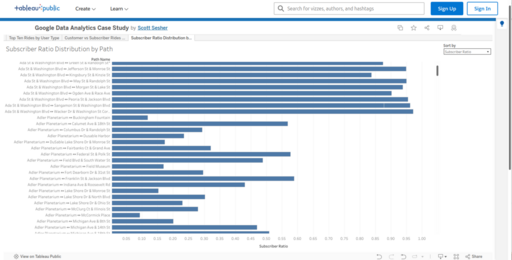
Sheet 3: Subscriber Ratio Distribution by Path (Histogram)
This histogram visualizes the distribution of ride paths (station-to-station pairs) by their subscriber ratio, defined as the proportion of rides taken by Subscribers versus Customers for each path. - The dataset includes all the bi-directional path with at least 10,000 rides. There are 88 such paths.
- Each path name represents one bi-directional path, with the length of the bar corresponding to the subscriber ratio (from 0% subscriber to 100%).
The chart can be sorted by:
- Path name (alphabetical)
- Subscriber ratio (to identify Customer-heavy or Subscriber-heavy routes)
This visualization reveals important asymmetries in how ride paths are used:
- Paths with very low subscriber ratios often correspond to tourist-heavy or leisure routes.
- Paths with high subscriber ratios are more likely to represent commuting corridors or utilitarian rides between residential and business areas.
🖼️ Static Visualizations
⏰ Temporal Patterns
Rides analyzed across time dimensions like hour, day, month, or season.
Non-Tourist Customer Rides by Hour of Day
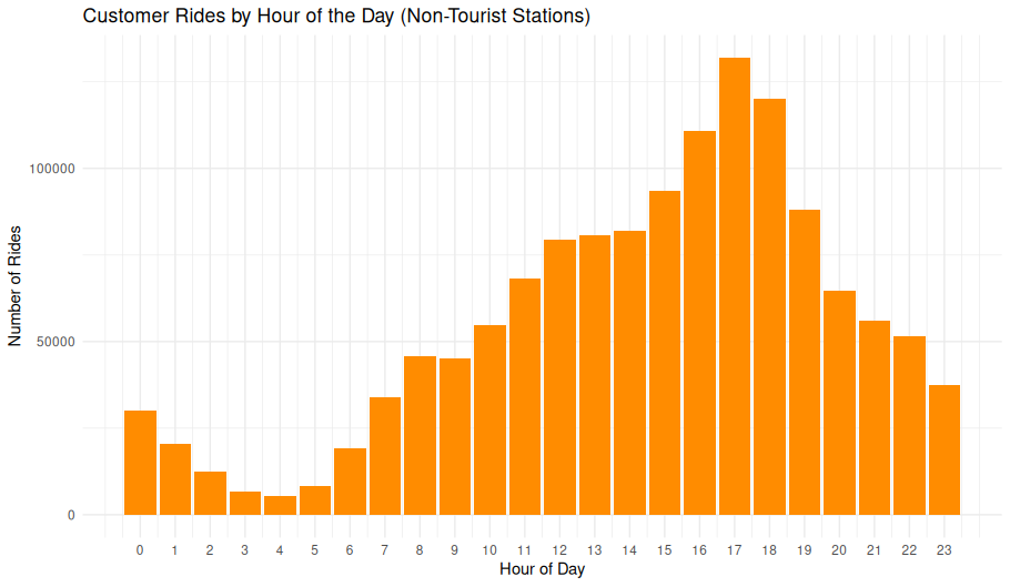
Overview
This bar chart shows how customer rides at non-tourist stations vary across the 24-hour day. By excluding rides from stations frequently used by tourists, this visualization highlights local usage patterns—such as commuting or neighborhood trips—distinct from sightseeing or visitor behavior.
Chart Details
- X-Axis: Hour of day (0 = midnight, 23 = 11 PM)
- Y-Axis: Number of rides started in each hour
- Bars: Hourly ride counts by customer users at non-tourist stations
Purpose
To identify when non-tourist customer rides occur most frequently and to reveal possible commuter or routine daily patterns among local riders.
Observations
- Early morning (0–5 AM): Minimal activity.
- Morning ramp-up (6–11 AM): Gradual increase as the day progresses.
- Midday plateau (12–15 PM): Consistent moderate ride volume.
- Peak period (16–18 PM): Pronounced spike with the highest volume around 17:00.
- Evening taper (19–23 PM): Gradual decline but still notable usage into the night.
Interpretation
The clear peak around 5 PM suggests: - After-work recreation or errands. - Possible casual commuting behavior. The modest morning volume and sustained midday usage indicate that, while some rides may be utilitarian, many are likely discretionary trips by locals.
Technical Notes
- Tourist stations were excluded based on a curated station ID list.
- Rides filtered to
customeruser type. - All timestamps converted to Chicago local time.
- Bin width: 1 hour per bar.
Data & Methods
- Data Source:
- Pre-processed dataframe
rides_by_hour_weekpart- Filtered by:
- Non-tourist station IDs
customeruser type- time converted to local time
- Filtered by:
- Pre-processed dataframe
- R Code Used to Generate Chart:
ggplot(rides_by_hour_weekpart, aes(x = hour, y = ride_count, fill = week_part)) +
    geom_col(position = "dodge") +
    labs(
        title = "Non-Tourist Customer Rides by Hour of Day",
        subtitle = "Adjusted to Chicago Local Time",
        x = "Hour of Day",
        y = "Ride Count",
        fill = "Day Type"
    ) +
    scale_x_continuous(breaks = 0:23) +
    theme_minimal()
Non-Tourist Customer Rides by Day of the Week
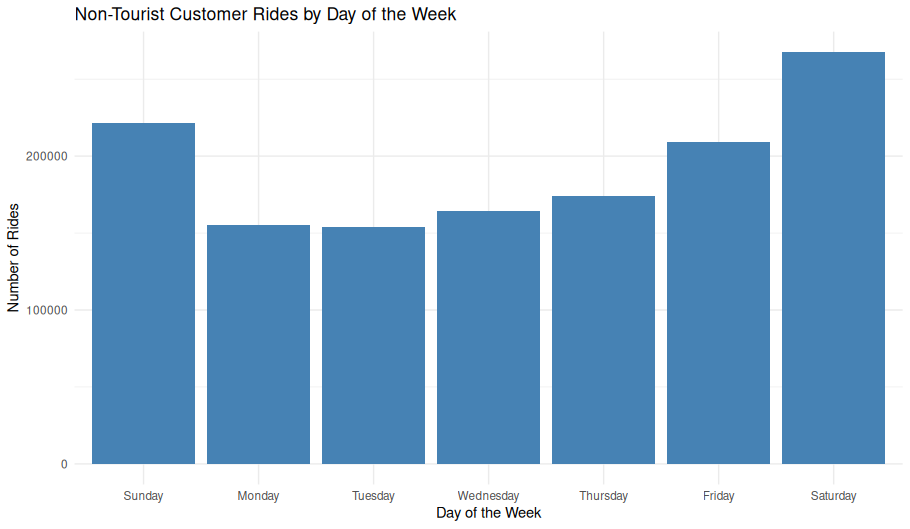
Overview
This bar chart displays the total number of customer rides at non-tourist stations, grouped by day of the week. By focusing on non-tourist stations, the visualization emphasizes local usage patterns rather than rides taken by visitors.
Chart Details
- X-Axis: Day of the week (Sunday through Saturday)
- Y-Axis: Total ride count per day
- Bars: Aggregate counts of rides initiated by customers at non-tourist stations
Purpose
To illustrate weekly patterns in casual (customer) ridership among local users, highlighting which days see higher or lower activity.
Observations
- Weekends (Saturday and Sunday): Highest ride volumes, indicating strong recreational or leisure usage.
- Weekdays (Monday–Friday): Lower and relatively consistent ride counts compared to weekends.
- Peak day: Saturday shows the most activity overall.
Interpretation
- The clear weekend peak suggests most customer rides are discretionary trips taken for leisure rather than routine commuting.
- The relative uniformity of weekday rides indicates a stable but smaller base of casual usage during the workweek.
Technical Notes
- Rides were filtered to:
customeruser type (not subscribers)- Exclude all tourist stations
- Day of week extracted from ride start timestamps (converted to local time)
Data & Methods
- Data Source:
- Pre-processed dataframe
non_tourist_customer_rides_df- Filtered by:
- Non-tourist station IDs
customeruser type
- Filtered by:
- Pre-processed dataframe
- R Code Used to Generate Chart:
ggplot(non_tourist_customer_rides_df, aes(x = day_of_week)) +
geom_bar(fill = "steelblue") +
labs(
title = "Non-Tourist Customer Rides by Day of the Week",
x = "Day of the Week",
y = "Number of Rides"
) +
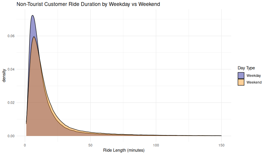
theme_minimal()Customer Rides by Hour: Weekday vs Weekend (Non-Tourist Stations)
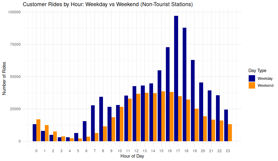
Overview
This grouped bar chart compares customer ride activity across hours of the day, split by weekday and weekend, limited to non-tourist stations. It highlights behavioral shifts in usage patterns between workdays and leisure days.
Chart Details
- X-Axis: Hour of day (0–23 in 24-hour format).
- Y-Axis: Number of rides initiated during that hour.
- Bars:
- Blue: Weekday ride counts.
- Orange: Weekend ride counts.
- Bars are grouped by hour to allow direct visual comparison between the two day types.
Purpose
This visualization is designed to isolate potential commuting or habitual usage patterns by removing the influence of tourist-heavy areas and separating ride behavior by the type of day.
Observations
- Weekday Trends:
- Strong late afternoon peak at 17:00 (5 PM) suggests post-work or school riding.
- Moderate increase starting around 7–8 AM, possibly indicating morning commutes.
- Subdued activity in the early morning and late evening.
- Weekend Trends:
- More even distribution throughout the midday and early afternoon.
- No sharp peak, but elevated ridership between 10:00 and 16:00.
- Morning and evening ride counts are lower than weekday equivalents.
Interpretation
- The sharp peak at 5 PM on weekdays strongly suggests commuter behavior, even among casual (non-subscriber) users.
- The flatter weekend profile indicates a more recreational or errand-driven pattern, with rides spread across daylight hours.
- Filtering out tourist stations helps reinforce the interpretation that these behaviors stem from local usage, not tourism.
Technical Notes
- Ride records are filtered to include only those starting at non-tourist stations.
- Users included are labeled as
customer(i.e., non-subscribers). - “Weekday” includes Monday through Friday; “Weekend” includes Saturday and Sunday.
- Time is derived from the local timestamp of the ride start.
Data & Methods
Data Sources - Data Frame: rides_by_hour_weekpart - Filters Applied: - Only customer rides (casual users) - Rides originating from non-tourist stations - Grouped by hour of day and week_part (Weekday vs Weekend)
R Code Used to Generate Chart:
ggplot(rides_by_hour_weekpart, aes(x = hour, y = ride_count, fill = week_part)) +
geom_col(position = "dodge") +
labs(
title = "Customer Rides by Hour: Weekday vs Weekend (Non-Tourist Stations)",
x = "Hour of Day",
y = "Number of Rides",
fill = "Day Type"
) +
scale_x_continuous(breaks = 0:23) +
scale_fill_manual(values = c("Weekday" = "darkblue", "Weekend" = "darkorange")) +
theme_minimal()
Customer Rides by Hour, Faceted by Season (Non-Tourist Stations)
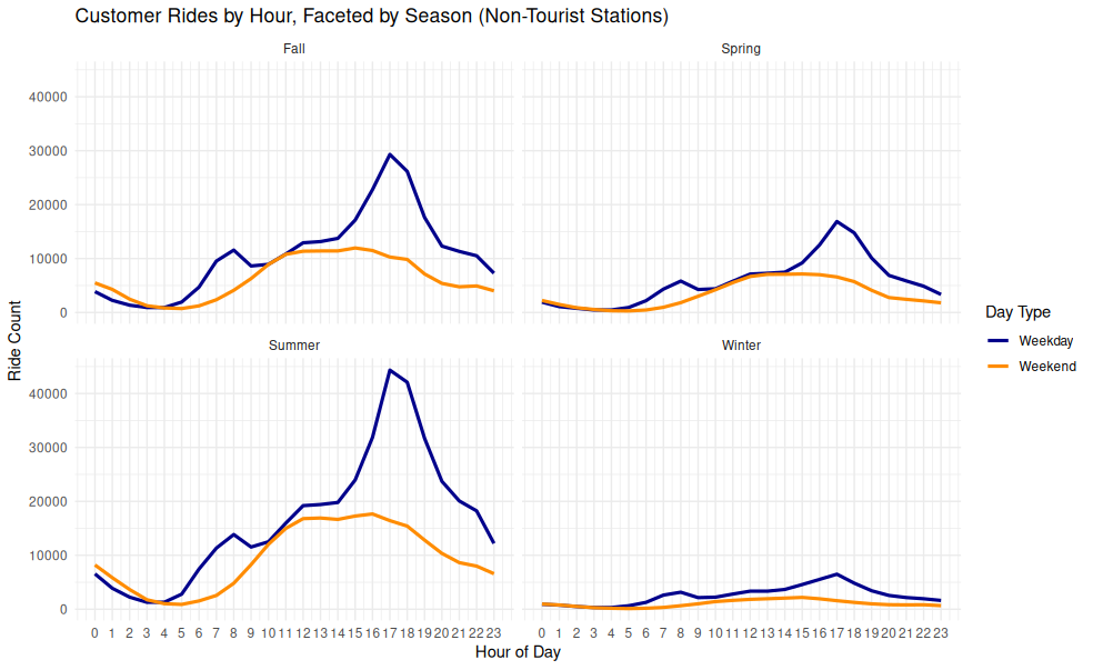
Overview
This faceted line chart visualizes customer rides over the hours of the day, separated by season and by weekday/weekend. It highlights how ridership patterns shift throughout the year.
Chart Details
X-Axis: Hour of Day (0–23)
Y-Axis: Ride Count
Facets: One panel per season (Spring, Summer, Fall, Winter)
Line Colors:
- Blue: Weekday
- Orange: Weekend
Purpose
To illustrate how both time of day and seasonality affect customer ride behavior when excluding tourist-heavy stations.
Observations
- Spring: Moderate volume, clear late afternoon weekday peak
- Summer: Highest usage, pronounced 17:00 weekday peak
- Fall: Similar shape to Spring, slightly lower counts
- Winter: Flat distribution, significantly reduced activity
Interpretation
- Commuting Behavior: Strong summer/fall weekday peaks around 17:00 suggest commuter-driven use, especially among customers using the system for one-way travel from work or transit.
- Recreation and Errands: Weekend rides are more spread throughout midday.
- Seasonal Sensitivity: Weekend ride patterns are flatter across the day and more seasonally stable, while weekday patterns show strong seasonal variation.
- Cold Weather Impact: Ridership drops sharply in winter across all times of day.
Technical Notes
- Timestamps were converted to local Chicago time.
- Day-of-week was used to classify rides into “Weekday” vs “Weekend”.
- Seasonal classification was derived from ride start dates.
- All rides were filtered to exclude tourist station IDs before analysis.
Data & Methods
Data Source
Data Frame: rides_by_hour_season
This dataframe includes:
- Filtered out tourist stations
- Filtered to customer rides
- Derived season from start timestamp
- Derived week_part from day of week
- Aggregated ride counts by hour, season, and day type
Data Source:
R Code Used to Generate the Chart:
ggplot(rides_by_hour_season, aes(x = hour, y = ride_count, color = week_part)) +
  geom_line(size = 1.1) +
  facet_wrap(~season, ncol = 2) +
  scale_x_continuous(breaks = 0:23) +
  scale_color_manual(values = c("Weekday" = "darkblue", "Weekend" = "darkorange")) +
  labs(
    title = "Customer Rides by Hour, Faceted by Season (Non-Tourist Stations)",
    x = "Hour of Day",
    y = "Ride Count",
    color = "Day Type"
  ) +
  theme_minimal()
Non-Tourist Customer Rides by Month
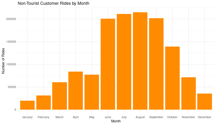
Overview
This bar chart displays the total number of rides initiated by customers (non-subscribers) at non-tourist stations, aggregated by calendar month. It shows clear seasonal patterns in ridership.
Chart Details
- X-Axis: Month (1 = January, 12 = December).
- Y-Axis: Total ride count for each month.
- Bars: Orange fill indicates the count of rides starting in each month.
Purpose
This visualization is intended to illustrate seasonal variation in usage, excluding tourist-heavy locations to focus on local customer ridership.
Observations
- Winter (Dec–Feb): Lowest ridership, likely due to cold weather.
- Spring (Mar–May): Steady increase as temperatures rise.
- Summer Peak (June–August): Highest ridership, peaking in July.
- Fall Decline (Sept–Nov): Gradual reduction in usage as temperatures cool.
Interpretation
The clear summer peak suggests that casual riders strongly prefer warm-weather months.

The exclusion of tourist stations reinforces that these are local usage patterns, not driven primarily by visitors.

Winter ridership does not drop to zero, indicating some year-round demand.
Data & Methods
Data Source:
- non_tourist_customer_rides_df
- Filtered to include:
- user_type == “customer”
- start_station_id in the non-tourist station list
R Code Used to Generate Chart:
ggplot(non_tourist_customer_rides_df, aes(x = month)) +
     geom_bar(fill = "darkorange") +
     labs(
         title = "Non-Tourist Customer Rides by Month",
         x = "Month",
         y = "Number of Rides"
     ) +
     theme_minimal()
Non-Tourist Customer Rides by Season
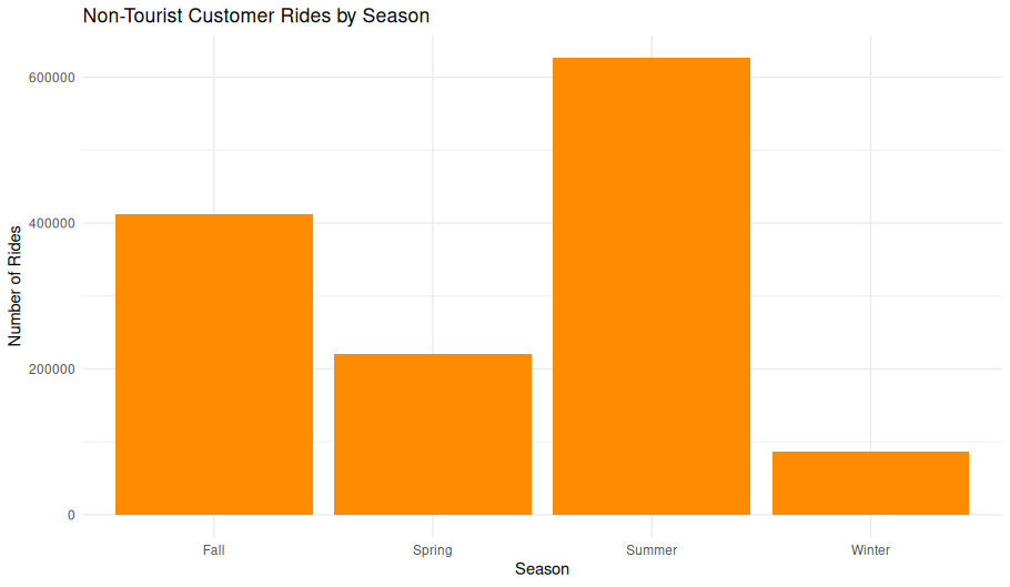
Overview
This bar chart summarizes the total ride volume by season for customers using non-tourist stations. It helps illustrate seasonal variability in casual riding behavior.
Chart Details
- X-Axis: Season (Spring, Summer, Fall, Winter)
- Y-Axis: Number of rides
- Bar Fill: Solid dark orange
Purpose
This chart highlights how seasonal factors influence casual ridership, such as weather and daylight availability, independent of tourist activity.
Observations
- Summer: Rides peak sharply, exceeding 600,000 rides—reflecting warm weather and extended daylight hours.
- Fall: Second-highest ridership, over 400,000 rides, showing sustained use into cooler months.
- Spring: More modest totals (~220,000 rides), likely reflecting a gradual ramp-up in riding.
- Winter: Lowest ridership (under 200,000), consistent with reduced bike use in cold conditions.
Interpretation
- The strong seasonal trend underscores the importance of temperature and daylight in casual rider behavior.
- Even excluding tourist hotspots, ridership in summer triples or quadruples winter levels.
- These patterns can inform resource allocation (e.g., rebalancing bikes) and maintenance scheduling.
Data Source
Filtered rides from the dataset: - non_tourist_customer_rides_df - Filters Applied: - user_type = customer - Start station ID in non-tourist stations list
R Code Used to Generate Chart:
ggplot(non_tourist_customer_rides_df, aes(x = season)) +
     geom_bar(fill = "darkorange") +
     labs(
         title = "Non-Tourist Customer Rides by Season",
         x = "Season",
         y = "Number of Rides"
     ) +
     theme_minimal()
Hourly Ride Patterns by Season and Day Type (Non-Tourist Stations)

ggplot(rides_by_hour_season, aes(x = hour, y = ride_count, fill = week_part)) +
  geom_col(position = "dodge") +
  facet_wrap(~season, ncol = 2) +
  scale_x_continuous(breaks = 0:23) +
  scale_fill_manual(values = c("Weekday" = "darkblue", "Weekend" = "darkorange")) +
  labs(
    title = "Hourly Ride Patterns by Season and Day Type (Non-Tourist Stations)",
    x = "Hour of Day",
    y = "Number of Rides",
    fill = "Day Type"
  ) +
  theme_minimal()
Non-Tourist Proportion of Daily Rides by Hour and Day Type

Non-Tourist Proportion of Daily Rides by Hour and Day Type
This heatmap visualizes the hourly share of total daily rides for non-tourist users, broken out by Day Type (Weekday vs. Weekend). Darker orange indicates a higher proportion of rides within that hour relative to the day’s total.
Key Observations:
- Weekdays show a pronounced peak around 17:00–18:00, corresponding to the evening commute.
- Weekend ride proportions are more evenly spread from late morning through mid-afternoon, peaking slightly between 12:00–16:00.
- Early morning (before 6:00) and late evening (after 21:00) show minimal ride activity for both day types.
This visualization provides insight into how ride timing differs based on routine schedules, further supporting inferences about commuter versus recreational behavior.
ggplot(ride_props, aes(x = hour, y = week_part, fill = prop)) +
     geom_tile() +
     scale_fill_gradient(low = "white", high = "darkorange") +
     labs(
         title = "Non-Tourist Proportion of Daily Rides by Hour and Day Type",
         x = "Hour of Day",
         y = "Day Type",
         fill = "Ride Proportion"
     ) +
     theme_minimal()
Difference in Ride Proportions Weedkay to Weekend
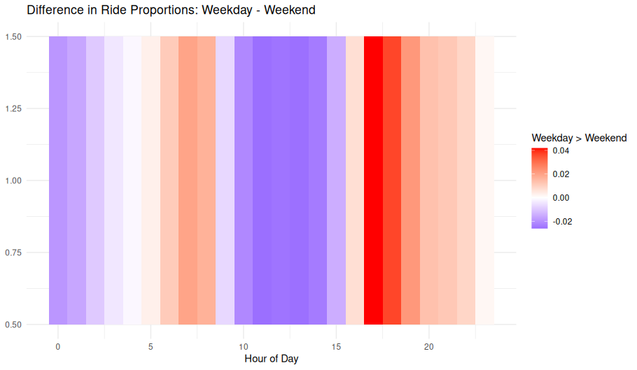
📝 Image Notes
Title: Difference in Ride Proportions: Weekday - Weekend X-axis: Hour of Day (0–23) Y-axis: Arbitrary (used to create banded heatmap effect) Color Scale:
- Red: Higher ride proportion on weekdays
- Blue: Higher ride proportion on weekends
- White: No significant difference in proportion
Interpretation
Morning hours (~7–9 AM) and afternoon hours (~4–6 PM) are clearly more active on weekdays, likely driven by commuting.
Midday (10 AM–3 PM) shows a higher proportional share of rides on weekends, possibly indicating more recreational usage during these hours.
Nighttime hours (~8 PM onward) still lean toward weekday use, albeit more modestly.
This visualization normalizes by total weekday and weekend ride volume, enabling meaningful comparison of usage patterns across the day regardless of total volume differences.
’’’R
ride_query <- sprintf(” SELECT ride_id, start_time, end_time, start_station_id, end_station_id, bike_type FROM rides WHERE user_type = 1 AND start_station_id IN (%s) AND end_station_id IN (%s) AND start_time >= strftime(‘%%s’, ‘2023-01-01’) “, station_ids_sql, station_ids_sql)
non_tourist_customer_rides_df <- dbGetQuery(con, ride_query)
non_tourist_customer_rides_df <- non_tourist_customer_rides_df %>% mutate( ride_date = as.Date(as.POSIXct(start_time, origin = “1970-01-01”)), day_of_week = weekdays(ride_date), month = format(ride_date, “%B”), season = case_when( month %in% c(“December”, “January”, “February”) ~ “Winter”, month %in% c(“March”, “April”, “May”) ~ “Spring”, month %in% c(“June”, “July”, “August”) ~ “Summer”, month %in% c(“September”, “October”, “November”) ~ “Fall” ) )
Add week, month, season
non_tourist_customer_rides_df <- non_tourist_customer_rides_df %>% mutate( start_datetime = as.POSIXct(start_time, origin = “1970-01-01”, tz = “America/Chicago”), day_of_week = wday(start_datetime, label = TRUE, abbr = FALSE), month = month(start_datetime, label = TRUE, abbr = FALSE), season = case_when( month(start_datetime) %in% c(12, 1, 2) ~ “Winter”, month(start_datetime) %in% c(3, 4, 5) ~ “Spring”, month(start_datetime) %in% c(6, 7, 8) ~ “Summer”, month(start_datetime) %in% c(9, 10, 11) ~ “Fall” ) )
Convert UTC to Chicago local time
non_tourist_customer_rides_df <- non_tourist_customer_rides_df %>% mutate( start_datetime = as.POSIXct(start_time, origin = “1970-01-01”, tz = “UTC”), start_localtime = with_tz(start_datetime, tzone = “America/Chicago”) )
rides_by_hour_weekpart <- non_tourist_customer_rides_df %>% mutate(hour = lubridate::hour(start_localtime), week_part = ifelse(lubridate::wday(start_localtime) %in% c(1, 7), “Weekend”, “Weekday”)) %>% group_by(week_part, hour) %>% summarise(ride_count = n(), .groups = “drop”)
ride_props <- rides_by_hour_weekpart %>% group_by(week_part) %>% mutate(prop = ride_count / sum(ride_count))
prop_wide <- ride_props %>% select(hour, week_part, prop) %>% tidyr::pivot_wider(names_from = week_part, values_from = prop) %>% mutate(diff = Weekday - Weekend) ’’’
ggplot(prop_wide, aes(x = hour, y = 1, fill = diff)) +
     geom_tile() +
     scale_fill_gradient2(low = "blue", high = "red", mid = "white", midpoint = 0) +
     labs(
         title = "Difference in Ride Proportions: Weekday - Weekend",
         x = "Hour of Day",
         y = NULL,
         fill = "Weekday > Weekend"
     ) +
     theme_minimal()
🌡️ Temperature and Weather Effects
Ride behavior as it relates to temperature (and optionally precipitation).
Hourly Rides vs. Temperature (2°C bins)

This chart illustrates the relationship between ambient temperature (°C) and the number of rides starting at that temperature. Data is grouped into 2°C bins to smooth short-term fluctuations and reveal broader trends..
- The x-axis shows temperature in degrees Celsius.
- The y-axis displays the total number of rides per bin, formatted with metric suffixes (e.g., 1k, 1m, etc).
- Grid lines and a clear legend outside the plot area aid interpretability.
Three ride categories are plotted:
- Total Rides (all users)
- Subscribers (dark blue line)
- Customers (dark orange line)
Insights:
- Bike usage increases with warmer weather, peaking for both Subscribers and Customers at 26°C (78.8∘F) temperatures, after which it falls off sharplybe.
- Subscribers tend to be less dependant on temperature range (correlation coefficient VALUE compared to VALUE for Customers), but sill follow the same basic pattern.
- Customers show a sharper increase in usage with warmth, indicating stronger sensitivity to weather.
These trends can inform operational decisions and user engagement strategies, particularly around marketing and bike redistribution efforts during seasonal changes.
Below is the the SQL command used to gather data for this chart.
.headers off
.mode tabs
.output temp_vs_rides.tsv

WITH binned AS (                          -- 2 °C comfort‑oriented buckets
    SELECT
        CAST(temp / 2.0 AS INT) * 2              AS temp_bin,         -- –10,‑8,…,34
        r.user_type,
        SUM(r.rides)                             AS rides
    FROM rides_per_hour_tbl   AS r
    JOIN hourly_weather       AS w  ON w.epoch = r.epoch
    GROUP BY temp_bin, r.user_type
), pivot AS (                             -- turn rows into columns
    SELECT
        temp_bin,
        SUM(rides)                                  AS total,
        SUM(CASE WHEN user_type='subscriber' THEN rides END) AS subs,
        SUM(CASE WHEN user_type='customer'   THEN rides END) AS cust
    FROM binned
    GROUP BY temp_bin
    ORDER BY temp_bin
)
SELECT temp_bin, total, subs, cust
FROM pivot;

.output stdout
set format y "%.0s%c"
set term wxt
set title "Hourly Rides vs. Temperature"
set xlabel "Temperature (°C)"
set ylabel "Rides per hour"
set grid
set datafile separator '\t'
set key outside
plot \
"temp_vs_rides.tsv" every ::1::34 using 1:2 with lines lw 2 lc rgb "black" title "Total", \
"" every ::1::34 using 1:3 with lines lw 2 lc rgb "dark-blue" title "Subscribers", \
"" every ::1::34 using 1:4 with lines lw 2 lc rgb "dark-orange" title "Customers"Hourly Ride Volume vs Temperature
ggplot(rides_weather_df, aes(x = temp, y = rides, color = user_type)) +
  geom_smooth(method = "loess", se = FALSE) +
  scale_y_continuous(labels = label_number(scale_cut = cut_short_scale())) +
  scale_color_manual(values = c("subscriber" = "blue", "customer" = "red")) +
  labs(
    title = "Hourly Ride Volume vs Temperature",
    x = "Temperature (°C)",
    y = "Hourly Ride Volume",
    color = "User Type"
  ) +
  theme_minimal()
Frequency of Temperature Bins
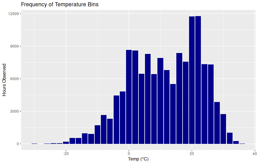
ggplot(aes(x = temp_bin, y = n)) +
  geom_col(fill = "gray") +
  labs(title = "Frequency of Temperature Bins", x = "Temp (°C)", y = "Hours Observed")
Ride Volume by Temperature and Precipitation
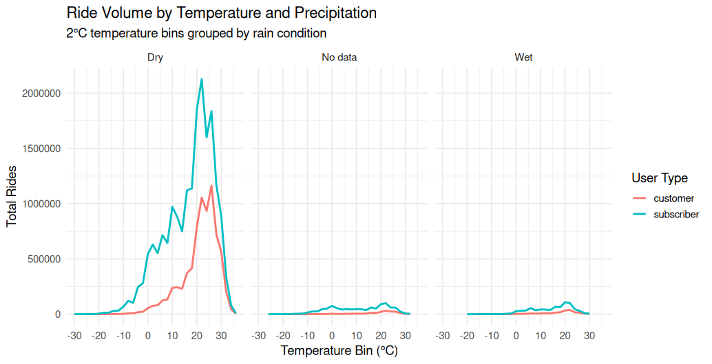
Overview
This line chart panel shows the total ride volume across 2°C temperature bins, broken down by user type (Customer vs. Subscriber) and grouped by rain condition (Dry, Wet, No data). Each panel represents a different precipitation category, allowing direct comparison of behavior under different weather conditions.
Chart Structure
- X-Axis (Temperature Bin °C):
- Temperature ranges from -30°C to +30°C.
- Binned in 2°C increments.
- Y-Axis (Total Rides):
- Number of rides recorded within each temperature bin.
- Facets (Panels):
- Dry: Rides that occurred with no recorded rain.
- No data: Weather data was missing.
- Wet: Rides that occurred during rain conditions.
- Lines:
- Red: Customer ride volume.
- Cyan: Subscriber ride volume.
Observations
Dry Conditions
- Most ride volume occurs here, peaking between 20–26°C.
- Subscribers consistently log more rides than customers across all temperature bins.
- Clear bell-shaped distribution centered around optimal riding weather (20–25°C).
No Data
- Very little volume, but patterns still mirror the dry curve.
- Could include early data before weather tracking began or corrupted weather records.
Wet Conditions
- Dramatic decrease in ride volume for both user types.
- Subscriber and customer patterns flatten and converge, showing less variance in behavior when it’s raining.
Interpretation
- Temperature strongly influences ridership, with optimal weather (20–25°C) showing the highest activity.
- Precipitation is a major deterrent, suppressing ride volume across all temperatures.
- Subscribers ride more often and in a wider temperature range than customers, especially when conditions are dry.
Use Case
This visualization helps: - Quantify the impact of weather on bike share demand. - Support decisions around dynamic pricing, rebalancing, or user alerts based on forecasted weather. - Segment usage patterns based on environmental conditions, without requiring detailed user data beyond type.
group_by(temp_bin, user_type, precip_label) %>%
summarise(rides = sum(rides), .groups = "drop") %>%
ggplot(aes(x = temp_bin, y = rides, color = user_type)) +
geom_line(size = 1) +
facet_wrap(~ precip_label, nrow = 1) +
labs(
title = "Ride Volume by Temperature and Precipitation",
subtitle = "2°C temperature bins grouped by rain condition",
x = "Temperature Bin (°C)",
y = "Total Rides",
color = "User Type"
) +
scale_x_continuous(breaks = seq(-30, 40, by = 10)) +
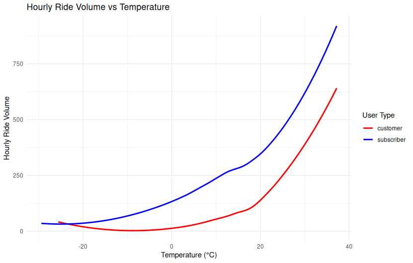
theme_minimal(base_size = 14)Temperature vs Ride Volume by User Type

Temperature vs Ride Volume by User Type
This dual-panel line plot compares hourly ride volume to temperature (°C) for customers (left) and subscribers (right). Both panels show a strong nonlinear increase in ride volume as temperatures rise.
Key Observations:
- Ride volume is lowest below freezing and begins to climb around 0°C.
- Subscribers maintain higher ride volume than customers across the full temperature range, suggesting greater resilience to cold weather.
- Both curves exhibit a steep increase above 20°C, peaking near 35–40°C.
- The growth is smooth and continuous, indicative of a nonlinear relationship rather than a threshold effect.
These findings support the inclusion of temperature as a continuous predictor of ride behavior in seasonal and temporal analyses.
ggplot(rides_weather_df, aes(x = temp, y = rides)) +
     geom_smooth(method = "loess", se = FALSE, color = "darkgreen") +
     scale_y_continuous(labels = label_number(scale_cut = cut_short_scale())) +
     facet_wrap(~ user_type) +
     labs(
         title = "Temperature vs Ride Volume by User Type",
         x = "Temperature (°C)",
         y = "Hourly Ride Volume"
     ) +
     theme_minimal()
Total Hourly Rides vs Temperature (Total, Subscribers and Customers)

Total Hourly Rides vs Temperature by User Type (2°C Buckets)
Overview
This chart shows how total rides vary with temperature, split between Subscribers and Customers. Ride counts are aggregated by temperature buckets, offering a side-by-side view of weather sensitivity by user group.
Chart Details
- X-Axis: Temperature in degrees Celsius, grouped into 2°C buckets.
- Y-Axis: Total number of rides aggregated per hourly bin across the dataset.
- Lines:
- Subscribers: Typically exhibit a sharper peak in moderate temperature ranges.
- Customers: Show a more gradual increase in ride volume as temperatures rise.
Purpose
The visualization helps compare how different user types respond to temperature changes. It reveals behavioral distinctions between Subscribers and Customers.
Observations
- Subscribers:
- Low ride volume below 10°C.
- Sharp peak near 25°C, suggesting strong commuting patterns tied to comfort.
- Rapid decline above 30°C, possibly due to heat discomfort.
- Customers:
- More gradual increase in ride volume with rising temperatures.
- Peak also around 25–30°C, but less steep rise and fall.
- Greater relative tolerance for warmer temperatures.
Interpretation
- Subscriber behavior is more concentrated and sensitive to moderate temperatures, likely tied to commuting habits.
- Customer rides are more distributed across a range of temperatures, aligning with recreational or discretionary use.
- The divergence in curve shapes supports the hypothesis of different underlying motivations between user groups.
Technical Notes
- Temperatures are binned into 2°C increments based on conditions at the start of each ride.
- Rides were grouped and summed by user type for each temperature bin, then aggregated hourly.
Average Hourly Rides vs Temperature (2° Buckets)

Overview
This chart presents the average number of hourly bike rides as a function of temperature (°C). The data is aggregated across all users, without distinguishing between subscriber or casual rider types.
Chart Details
- X-Axis: Temperature in degrees Celsius, ranging from below -10°C to above 35°C.
- Y-Axis: Average hourly ride count.
- Line: A single curve showing average ride volume across all users, bucketed by temperature.
Purpose
This visualization is intended to illustrate how temperature alone affects overall ridership behavior, independent of time of day, day of week, or rider category.
Observations
- Sub-zero temperatures (< 0°C): Very low ridership, close to zero, as expected.
- Gradual increase: Ride volume increases steadily with temperature from around 0°C to the low 20s.
- Peak ridership: Occurs near 25°C, representing the optimal weather for riding.
- Drop-off above 30°C: Suggests decreased willingness to ride in high heat, likely due to discomfort or health concerns.
Interpretation
- The chart suggests a strong correlation between temperature and total ride volume.
- The symmetric, bell-shaped curve implies that moderate temperatures are ideal for cycling.
- Extremes on either end (cold or hot) sharply reduce bike usage.
Technical Notes
- Rides are put into bucked with 2°C increments based on the temperature at ride start times.
- The “2-bucket” term refers to the fact that the temperatures readings were grouped into bins of 2°C. Binning is a form of data smoothing applied to reduce noise.
.headers off          -- we only want raw numbers
.mode tabs            -- gnuplot likes tab‑ or space‑separated columns
.output temp_vs_rides.dat
WITH t AS (
  SELECT
    CAST(temp / 2.0 AS INT)*2  AS temp_bin,   -- 2 °C buckets: …, 14, 16, 18 …
    AVG(rides)                 AS avg_rides
  FROM rides_weather
  GROUP BY temp_bin
  ORDER BY temp_bin
)
SELECT temp_bin, avg_rides
FROM t;
.output stdout         -- restore console
set title "Average hourly rides vs. temperature"
set xlabel "Temperature (°C)"
set ylabel "Average rides per hour"
set grid
set key off
# Simple connected line
plot "temp_vs_rides.dat" using 1:2 with linespoints lw 2 pt 7Average Hourly Rides vs Temperature (2° Buckets with cubic spline interpolation)

Overview
This chart presents the average number of hourly bike rides as a function of temperature (°C). The data is aggregated across all users, without distinguishing between subscriber or casual rider types.
Chart Details
- X-Axis: Temperature in degrees Celsius, ranging from below -10°C to above 35°C.
- Y-Axis: Average hourly ride count.
- Line: A single curve showing average ride volume across all users, smoothed with cubic spline interpolation and bucketed by temperature.
Purpose
This visualization is intended to illustrate how temperature alone affects overall ridership behavior, independent of time of day, day of week, or rider category.
Observations
- Sub-zero temperatures (< 0°C): Very low ridership, close to zero, as expected.
- Gradual increase: Ride volume increases steadily with temperature from around 0°C to the low 20s.
- Peak ridership: Occurs near 25°C, representing the optimal weather for riding.
- Drop-off above 30°C: Suggests decreased willingness to ride in high heat, likely due to discomfort or health concerns.
Interpretation
- The chart suggests a strong correlation between temperature and total ride volume.
- The symmetric, bell-shaped curve implies that moderate temperatures are ideal for cycling.
- Extremes on either end (cold or hot) sharply reduce bike usage.
Technical Notes
- Rides are put into bucked with 2°C increments based on the temperature at ride start times.
- The “2-bucket” term refers to the fact that the temperatures readings were grouped into bins of 2°C. Binning is a form of data smoothing applied to reduce noise.
- Curve was further smoothrf though the use of cubic spline interpolation, which creates a smooth, curved line that passes through the data points.
.headers off          -- we only want raw numbers
.mode tabs            -- gnuplot likes tab‑ or space‑separated columns
.output temp_vs_rides.dat
WITH t AS (
  SELECT
    CAST(temp / 2.0 AS INT)*2  AS temp_bin,   -- 2 °C buckets: …, 14, 16, 18 …
    AVG(rides)                 AS avg_rides
  FROM rides_weather
  GROUP BY temp_bin
  ORDER BY temp_bin
)
SELECT temp_bin, avg_rides
FROM t;
.output stdout         -- restore console
set title "Average hourly rides vs. temperature"
set xlabel "Temperature (°C)"
set ylabel "Average rides per hour"
set grid
set key off
# smoothed curve (Cubic Spline)
plot "temp_vs_rides.dat" using 1:2 smooth csplines lw 2⏳ Ride Duration and Distance Distributions
Focused on duration, distance, and their distributions by user type or cluster.
Ride Duration Distribution by User Type
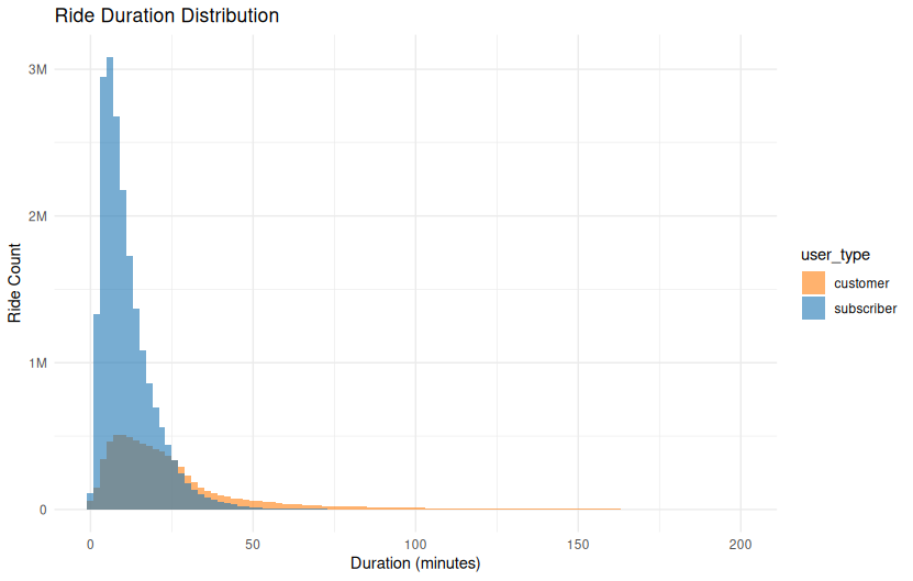
Overview
This histogram shows how ride durations differ between Subscribers and Customers. The distribution is plotted as a count of rides by duration (in minutes), revealing distinct usage patterns between user types.
Chart Details
- X-Axis: Ride duration in minutes, from 0 to 200 minutes.
- Y-Axis: Count of rides in each duration bin.
- Bars:
- Blue (Subscribers): Rides are tightly clustered around shorter durations.
- Orange (Customers): Rides are more spread out, with a longer tail.
- Bin Width: 2 minutes per bar.
Purpose
This visualization compares usage patterns between customers and subscribers, showing that the two groups engage with the bike share system very differently in terms of how long they ride.
Observations
- Subscribers:
- Majority of rides are under 30 minutes.
- Strong peak around 10–15 minutes.
- Rapid drop-off after 30 minutes, suggesting time-constrained rides (possibly to avoid overage fees).
- Customers:
- Ride duration distribution is flatter and broader.
- Significant number of rides extend beyond 30 minutes.
- Tail extends beyond 100 minutes, though with diminishing frequency.
Interpretation
- Subscriber rides are likely utilitarian — such as commuting or quick errands — and are likely influenced by pricing plans that encourage shorter trips.
- Customer rides are more exploratory or recreational, often longer and less time-sensitive.
- The chart highlights a fundamental behavioral difference in how the system is used by each group.
Technical Notes
- Duration is measured from ride start to ride end.
- Rides over 200 minutes are excluded from the chart for scale clarity.
- The bin width used for this histogram is likely around 1 minute per bar, offering detailed resolution at shorter durations.
Data Source
# Connect to the SQLite database
con <- dbConnect(RSQLite::SQLite(), "caseStudy.db")

# Pull ride durations for valid subscriber/customer rides under 200 min
ride_durations <- dbGetQuery(con, "
  SELECT
    CASE user_type
      WHEN 0 THEN 'subscriber'
      WHEN 1 THEN 'customer'
    END AS user_type,
    (end_time - start_time) / 60.0 AS duration_min
  FROM rides
  WHERE user_type IN (0, 1)
    AND end_time > start_time
    AND (end_time - start_time) < 12000
")

# Disconnect
 dbDisconnect(con)
R Code Used to Generate Chart:
ggplot(ride_durations, aes(x = duration_min, fill = user_type)) +
geom_histogram(binwidth = 2, position = "identity", alpha = 0.6) +
labs(title = "Ride Duration Distribution", x = "Duration (minutes)", y = "Ride Count") +
scale_fill_manual(values = c("subscriber" = "#1f77b4", "customer" = "#ff7f0e")) +
scale_y_continuous(labels = label_number(scale_cut = cut_short_scale())) +
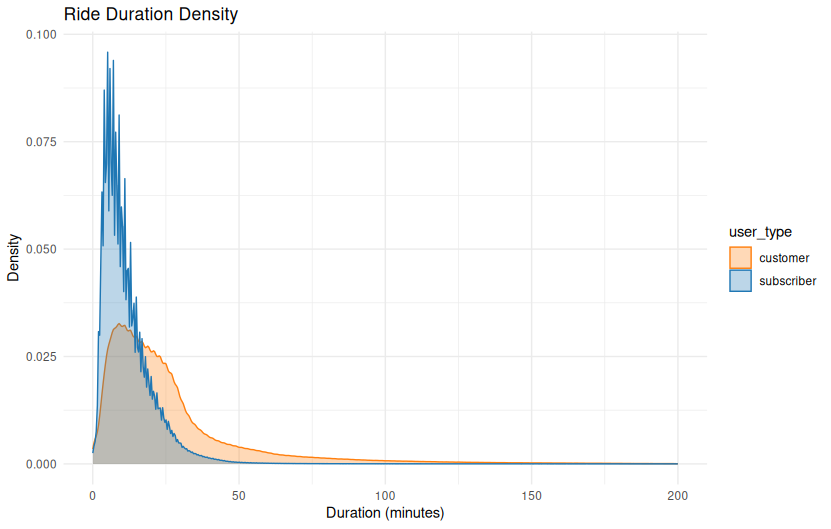
theme_minimal()Ride Duration Density
# Connect to the SQLite database
con <- dbConnect(RSQLite::SQLite(), "caseStudy.db")

# Pull ride durations for valid subscriber/customer rides under 60 min
ride_durations <- dbGetQuery(con, "
  SELECT
    CASE user_type
      WHEN 0 THEN 'subscriber'
      WHEN 1 THEN 'customer'
    END AS user_type,
    (end_time - start_time) / 60.0 AS duration_min
  FROM rides
  WHERE user_type IN (0, 1)
    AND end_time > start_time
    AND (end_time - start_time) < 12000
")

# Disconnect
dbDisconnect(con)ggplot(ride_durations, aes(x = duration_min, color = user_type, fill = user_type)) +
geom_density(alpha = 0.3) +
labs(title = "Ride Duration Density", x = "Duration (minutes)", y = "Density") +
scale_color_manual(values = c("subscriber" = "#1f77b4", "customer" = "#ff7f0e")) +
scale_fill_manual(values = c("subscriber" = "#1f77b4", "customer" = "#ff7f0e")) +
theme_minimal()Ride Duration by User Type ( box plot )

# Connect to the SQLite database
con <- dbConnect(RSQLite::SQLite(), "caseStudy.db")

# Pull ride durations for valid subscriber/customer rides under 60 min
ride_durations <- dbGetQuery(con, "
  SELECT
    CASE user_type
      WHEN 0 THEN 'subscriber'
      WHEN 1 THEN 'customer'
    END AS user_type,
    (end_time - start_time) / 60.0 AS duration_min
  FROM rides
  WHERE user_type IN (0, 1)
    AND end_time > start_time
    AND (end_time - start_time) < 12000
")

# Disconnect
dbDisconnect(con)ggplot(ride_durations, aes(x = user_type, y = duration_min, fill = user_type)) +
geom_boxplot(outlier.alpha = 0.1) +
labs(title = "Ride Duration by User Type", x = "", y = "Duration (minutes)") +
scale_fill_manual(values = c("subscriber" = "#1f77b4", "customer" = "#ff7f0e")) +
theme_minimal()Ride Duration Distribution by Weekday vs Weekend (Non-Tourist Customers)
This density plot shows the distribution of ride durations in minutes for non-tourist customer rides, separated by weekdays and weekends. Weekday rides tend to peak slightly earlier and higher than weekend rides, indicating a stronger presence of short utility trips during the work week.
Overview
This kernel density plot compares the ride duration (in minutes) of non-tourist customer bike rides, distinguishing between weekday and weekend behavior. It focuses exclusively on non-subscriber riders whose trips did not start or end near tourist destinations.
Axes
- X-Axis (Ride Length in Minutes):
- Ranges from 0 to 150 minutes.
- Measures the total ride time as reported in the dataset.
- Focuses on the practical duration range; longer trips beyond 150 minutes were likely excluded or negligible.
- Y-Axis (Density):
- Represents the smoothed distribution of ride durations using kernel density estimation.
- Higher values reflect more common durations.
Day Type Colors
- Weekday (Blue):
- Strong peak at short durations (approximately 6–8 minutes).
- Steeper decline after peak.
- Weekend (Orange):
- Peak is broader and slightly lower, centered just after 8 minutes.
- Slower decline, suggesting more variety in weekend usage.
Observations
- Weekday rides are slightly shorter on average and more tightly concentrated.
- Likely dominated by quick errands, commutes, or first-mile/last-mile transport.
- Weekend rides show greater variability.
- Suggests a mix of errand and recreational uses, especially among customers who may be exploring neighborhoods or casually traveling.
- Both distributions are right-skewed, with long tails indicating occasional extended rides by some users.
Behavioral Insight
This view supports the hypothesis that weekday customer rides are more task-oriented, while weekend usage involves longer, discretionary trips. Although the differences are subtle, they are consistent with other indicators of time-based travel patterns in non-tourist areas.
Use Case
This chart is useful for: - Understanding ride duration norms by day type. - Supporting demand modeling and pricing strategies tailored to weekdays vs weekends. - Refining customer journey segmentation without needing user-level metadata.
ggplot(non_tourist_customer_rides_df, aes(x = ride_length_min, fill = week_part)) +
     geom_density(alpha = 0.4) +
     scale_fill_manual(values = c("Weekday" = "darkblue", "Weekend" = "darkorange")) +
     labs(
         title = "Non-Tourist Customer Ride Duration by Weekday vs Weekend",
         x = "Ride Length (minutes)",
         fill = "Day Type"
     ) +
     theme_minimal()
Non-Tourist Customer Ride Duration Density
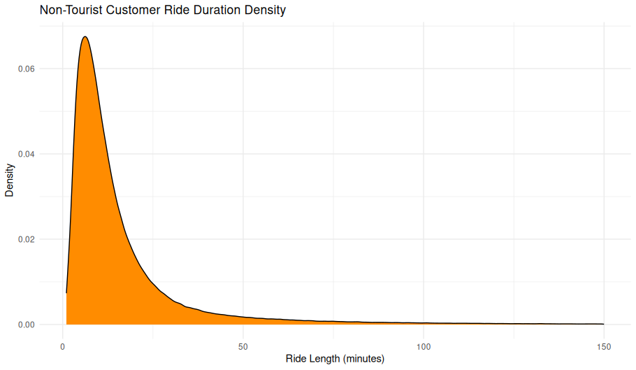
ggplot(non_tourist_customer_rides_df, aes(x = ride_length_min)) +
     geom_density(fill = "darkorange") +
     labs(
         title = "Non-Tourist Customer Ride Duration Density",
         x = "Ride Length (minutes)",
         y = "Density"
     ) +
     theme_minimal()
Non-Tourist Customer Ride Duration for Loop Rides
Ride Duration vs. Station Distance (Non-Tourist Customers)
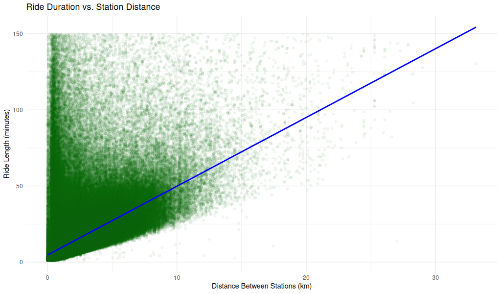
Overview
This scatterplot shows the relationship between ride duration and station-to-station distance for non-tourist customer rides. A linear reference line is included for interpretive comparison.
Axes
- X-Axis (Distance Between Stations in km):
- Ranges from 0 to ~30 km.
- Represents the straight-line distance between the ride’s start and end stations.
- Y-Axis (Ride Length in minutes):
- Ranges from 0 to 150 minutes.
- Indicates the duration of each ride.
Visual Elements
- Green points:
- Represent individual non-tourist customer rides.
- Heavily concentrated in the lower-left region, tapering as distance increases.
- Blue line:
- A linear reference line (possibly showing a constant-speed model or fitted trend).
- Helps visualize the general relationship between time and distance.
Observations
- Dense cluster near origin:
- The majority of rides are short in both duration and distance.
- Suggests highly localized use, likely for errands or short commutes.
- Wide variance in ride length for short distances:
- Some very short-distance rides take a long time — could indicate indirect routes, traffic, or leisurely pacing.
- Sparse long-distance rides:
- As station distance increases, rides become less frequent but follow a wider spread of durations.
- Linear boundary below the point cloud:
- The blue line roughly follows the lower edge of the ride cloud, suggesting a speed floor (minimum speed threshold).
- This could represent the fastest direct rides, possibly made with electric bikes or scooters.
Interpretation
- There’s a positive relationship between station distance and ride duration, but with high variance.
- Many long-duration rides cover only short distances, hinting at circuitous routes, heavy traffic, or recreational usage.
- The plot may also reflect the impact of stop time (e.g., errands, pauses) not being filtered out.
Use Case
This visualization helps: - Explore efficiency and routing behavior of customers. - Identify outliers and usage extremes (e.g., long duration for short distances). - Evaluate suitability of distance as a proxy for estimating ride time.
non_loop_rides_df <- non_tourist_customer_rides_df %>%
filter(start_station_id != end_station_id)
library(geosphere)  # for distHaversine
non_loop_rides_df <- non_loop_rides_df %>%
left_join(non_tourist_stations_df %>% select(start_station_id = station_id, start_lat = latitude, st
art_lon = longitude),
by = "start_station_id") %>%
left_join(non_tourist_stations_df %>% select(end_station_id = station_id, end_lat = latitude, end_lo
n = longitude),
by = "end_station_id") %>%
mutate(
distance_m = distHaversine(matrix(c(start_lon, start_lat), ncol = 2),
matrix(c(end_lon, end_lat), ncol = 2)),
distance_km = distance_m / 1000
)


non_loop_rides_df <- non_loop_rides_df %>%
left_join(stations_df %>%
rename(start_station_id = station_id,
start_lat = lat,
start_long = long),
by = "start_station_id") %>%
left_join(stations_df %>%
rename(end_station_id = station_id,
end_lat = lat,
end_long = long),
by = "end_station_id")
non_loop_rides_df <- non_loop_rides_df %>%
mutate(
distance_m = distHaversine(
matrix(c(start_long, start_lat), ncol = 2),
matrix(c(end_long, end_lat), ncol = 2)
),
distance_km = distance_m / 1000
)
'''


'''R
library(ggplot2)
ggplot(non_loop_rides_df, aes(x = distance_km, y = ride_length_min)) +
geom_point(alpha = 0.05, color = "darkgreen") +
geom_smooth(method = "lm", se = FALSE, color = "blue") +
labs(
title = "Ride Duration vs. Station Distance",
x = "Distance Between Stations (km)",
y = "Ride Length (minutes)"
) +
theme_minimal()
Non-Tourist Customer Ride Count by Distance
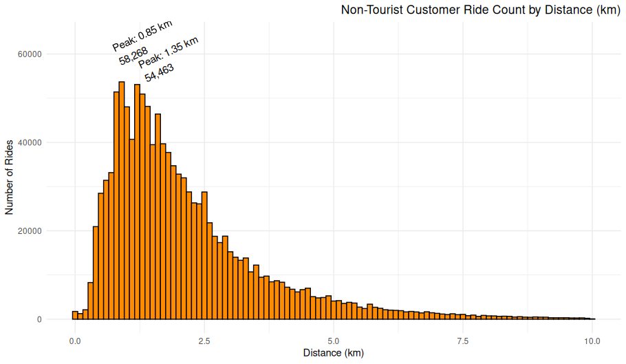
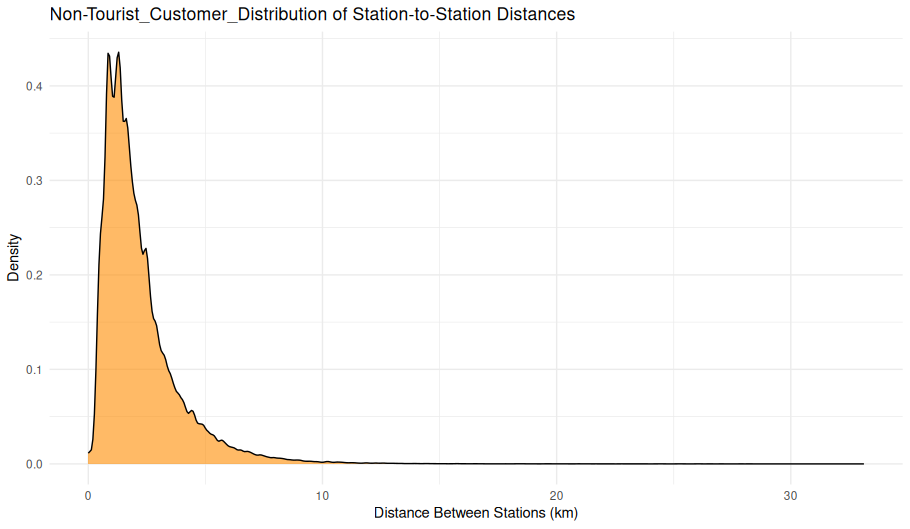
Station-to-Station Distance Distribution (Non-Tourist Customers)
Overview
This density plot visualizes the distribution of distances between starting and ending stations for rides taken by casual (non-subscriber) users that do not involve tourist stations. The x-axis represents the distance in kilometers between two stations, and the y-axis represents the relative density of those ride distances.
Chart Details
X-Axis: Distance Between Stations (km), ranging from 0 to just over 30 km
Y-Axis: Relative density of rides occurring at each distance
Plot Style: Area-under-curve density plot (not a histogram), with a smooth curve and filled region
Purpose
This visualization is intended to show the typical ride distance for casual users avoiding tourist destinations. It highlights the patterns in short-to-moderate-distance usage of the bike-sharing system.
Observations
Peak around 1–2 km: The majority of rides occur between stations that are 1–2 km apart.
Steep decline: Ride density drops rapidly for distances above 5 km.
Long tail: A small number of rides extend beyond 10 km, with rare outliers over 20 km.
Very few extreme values: This confirms most rides are short-distance, utility-based.
Interpretation
The shape of the distribution suggests a strong preference for short-distance urban travel, which aligns with errand-running, last-mile commuting, or intra-neighborhood trips.
The sharp tapering suggests little casual use for long-distance travel, at least outside of tourist-heavy areas.
Technical Notes
Ride distances were calculated using the great-circle distance (Haversine formula) between station coordinates.
Tourist stations were excluded using a station filter based on known landmarks and locations.
Density plots normalize the area under the curve to 1, so the y-axis values represent probability density, not raw ride counts.
ggplot(non_loop_rides_df, aes(x = distance_km)) +
geom_density(fill = "darkorange", alpha = 0.6) +
labs(
title = "Non-Tourist_Customer_Distribution of Station-to-Station Distances",
x = "Distance Between Stations (km)",
y = "Density"
) +
theme_minimal()
Ride Distance Distribution by Duration Cluster (Non-Tourist, Non-Loop, Customers)
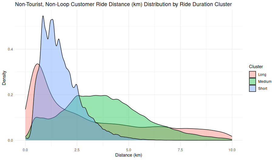
Overview
This kernel density plot illustrates the distribution of ride distances (in kilometers) for non-tourist, non-loop customer rides, broken out by ride duration clusters labeled as Short, Medium, and Long.
Axes
- X-Axis (Distance in km):
- Ranges from 0 to 10 km.
- Represents the straight-line distance from the start stations to the end stations (the minimum possilbe distatnce covered). Do not confuse this with the actual distance ridden, we have no way of knowing that from the currently available data.
- Y-Axis (Density):
- Represents the probability density of ride distances within each cluster.
- Higher peaks indicate more common distances in that cluster.
Cluster Colors
- Short (Blue):
- Peaks sharply between 0.5–2.5 km.
- Characterized by high density at shorter distances and a quick drop-off after 3 km.
- Medium (Green):
- Peaks broadly from ~2.5 km to 6 km.
- Forms a wider and flatter distribution, indicating greater variability in ride lengths.
- Long (Red/Pink):
- Starts lower but maintains a relatively even presence across 3–10 km.
- Longest tail, with density extending up to the maximum distance shown (10 km).
Observations
- Short Cluster:
- Highest density of all clusters.
- Indicates that most customer rides classified as “short” are under 3 km.
- May reflect last-mile or station-to-neighborhood travel.
- Medium Cluster:
- Broadest range of distances.
- Overlaps with both short and long clusters, suggesting transitional ride behavior.
- Long Cluster:
- Less frequent but not rare.
- Ride distances in this group begin at approximatley 1.5 km and extend up to 10 km.
- Possibly includes destination-oriented or special-purpose trips.
Interpretations
- Behavioral Insights:
- The sharp peak of the short cluster implies highly consistent short-distance use, likely for errands or short hops.
- The medium cluster suggests a flexible usage pattern, potentially including both commuting and recreational trips.
- Long-duration rides, although less common, cover the widest distance range, reflecting diverse travel purposes.
- Data Characteristics:
- Rides were filtered to exclude tourist, subscribers and loop rides, increasing the likelihood that these reflect practical customer travel behavior (e.g., commuting, errands).
- Clustering these customer rides by duration helps uncover distinct usage patterns — such as short errand-like trips versus longer recreational journeys — without needing to segment riders any further or rely on additional metadata.
Use Case
This chart helps: - Understand ride behavior by duration across distance ranges. - Support clustering-based segmentation strategies. - Inform infrastructure placement, pricing models, or service design for non-tourist use cases.
Non-Tourist Non-Loop Customer Ride Distance Distribution by Ride Duration Cluster 201M Grid

Loop Ride Length Distribution by Week Part and Time of Day
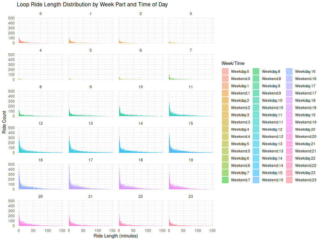
📝 Image Notes
Title: Loop Ride Length Distribution by Week Part and Time of Day Source: Non-tourist customer rides classified as “loop rides” (start and end at the same station) X-Axis: Ride Length (minutes) Y-Axis: Ride Count Faceting: 24 hourly bins (0–23), each split by weekday/weekend Color Encoding: Different fill colors for each Week.Part.Hour combination (e.g., Weekend.0, Weekday.14) shown in the legend
Key Observations
Consistent Right Skew: In every hourly panel, ride length distributions are heavily skewed right, peaking in the 0–10 minute range and tapering off sharply.

No Strong Time-of-Day Effect: There is no significant shift in distribution shape across hours, though some hour blocks (e.g., mid-afternoon) show more total rides.

Loop Behavior: This pattern reinforces the idea that many loop rides — likely recreational — are short and time-insensitive.

Weekend vs. Weekday: Although both categories are shown, the duration distributions remain similar, suggesting time of day may be less influential for loop ride length than ride purpose or rider type.ggplot(loop_rides_non_tourist, aes(x = ride_length_min, fill = interaction(week_part, hour_local)))
+
geom_histogram(binwidth = 1, position = "identity", alpha = 0.5) +
facet_wrap(~ hour_local, ncol = 4) +
labs(title = "Loop Ride Length Distribution by Week Part and Time of Day",
x = "Ride Length (minutes)",
y = "Ride Count",
fill = "Week/Time") +
theme_minimal()🗺️ Spatial Patterns
This section presents spatial insights into non-tourist customer rides, highlighting both where trips originate and terminate (station popularity) and how far riders typically travel between stations. Together, these views illustrate usage density and trip distances across the system.
Top 25 Non-Tourist Stations by Customer Ride Count
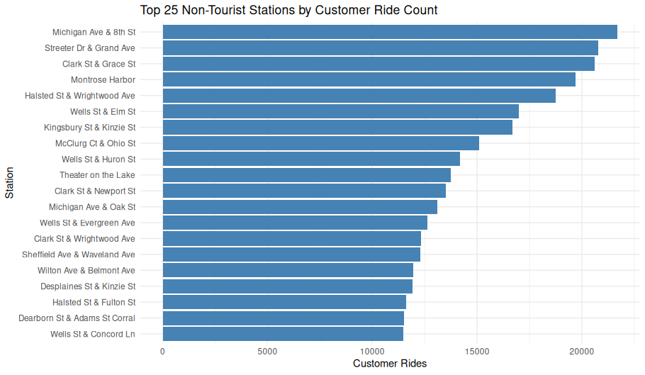
ggplot(top_non_tourist_stations_named, aes(
x = reorder(name, customer_ride_count),
y = customer_ride_count
)) +
geom_col(fill = "steelblue") +
coord_flip() +
labs(
title = "Top 25 Non-Tourist Stations by Customer Ride Count",
x = "Station",
y = "Customer Rides"
) +
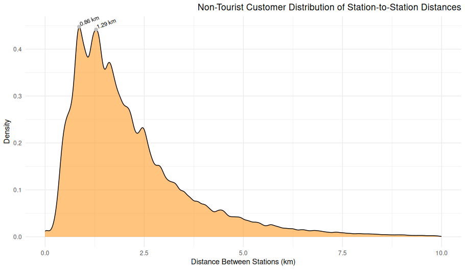
theme_minimal()Station-to-Station Distance Distribution (Non-Tourist Customers)
Overview
This density plot visualizes the distribution of distances between starting and ending stations for rides taken by casual (non-subscriber) users that do not involve tourist stations. The x-axis represents the distance in kilometers between two stations, and the y-axis represents the relative density of those ride distances.
Chart Details
X-Axis: Distance Between Stations (km), ranging from 0 to just over 30 km
Y-Axis: Relative density of rides occurring at each distance
Plot Style: Area-under-curve density plot (not a histogram), with a smooth curve and filled region
Purpose
This visualization illustrates the spatial extent of trips, showing how far non-tourist customers typically travel between stations across the system.
Observations
Peak around 1–2 km: The majority of rides occur between stations that are 1–2 km apart.
Steep decline: Ride density drops rapidly for distances above 5 km.
Long tail: A small number of rides extend beyond 10 km, with rare outliers over 20 km.
Very few extreme values: This confirms most rides are short-distance, utility-based.
Interpretation
The shape of the distribution suggests a strong preference for short-distance urban travel, which aligns with errand-running, last-mile commuting, or intra-neighborhood trips.
The sharp tapering suggests little casual use for long-distance travel, at least outside of tourist-heavy areas.
Technical Notes
Ride distances were calculated using the great-circle distance (Haversine formula) between station coordinates.
Tourist stations were excluded using a station filter based on known landmarks and locations.
Density plots normalize the area under the curve to 1, so the y-axis values represent probability density, not raw ride counts.
ggplot(non_loop_rides_df, aes(x = distance_km)) +
geom_density(fill = "darkorange", alpha = 0.6) +
labs(
title = "Non-Tourist_Customer_Distribution of Station-to-Station Distances",
x = "Distance Between Stations (km)",
y = "Density"
) +
theme_minimal()
Fleet & Usage Patterns
Insights about bikes themselves and system-level metrics.
Average Daily Rides by Bike Type and User Type (Post-Electric Launch)

Overview
This bar chart displays the average number of daily rides by bike type, grouped by user type (Subscriber vs. Customer), for the period after the introduction of electric bikes and scooters.
Axes and Groupings
- X-Axis (Bike Type):
classic_bikedocked_bikeelectric_bikeelectric_scooter
- Y-Axis (Average Rides per Day):
- Ranges from 0 to over 4,500 rides per day.
- Color Legend:
- Red = Subscriber
- Teal = Customer
Observations
- Classic Bikes:
- Most used overall.
- Subscribers (red) significantly outnumber Customers in ride volume.
- Docked Bikes:
- Very low usage overall.
- Only Customers use docked bikes in this dataset — Subscribers have no visible rides.
- Electric Bikes:
- Popular among both user types.
- Subscribers still dominate, but the Customer share is substantial.
- Electric Scooters:
- Slightly more popular with Customers than Subscribers.
- Total volume is lower than bikes but non-trivial.
Interpretation
- Subscriber Preference:
- Strongly favors classic and electric bikes.
- Likely reflects commuting and utilitarian travel patterns.
- Customer Preference:
- More evenly spread across bike types.
- Higher share of docked bike and scooter usage, suggesting casual or occasional use.
- Modal Shift:
- The presence of electric modes (bike and scooter) introduces significant usage from both user groups, possibly pulling some traffic away from classic bikes.
Use Case
This visualization supports: - Infrastructure planning (e.g., expansion of electric charging or docking stations), - Marketing strategy (targeting modal preferences by user type), - Evaluating post-launch success of electric mobility options.
post_electric_rides_df <- dbGetQuery(con, "SELECT
   DATE(start_time, 'unixepoch') AS ride_date,
   user_type,
   bike_type,
   COUNT(*) AS ride_count,
   AVG((end_time - start_time) / 60.0) AS avg_duration_minutes
FROM rides
WHERE start_time >= strftime('%s', '2023-01-01') --first e-bike appeared
GROUP BY ride_date, user_type, bike_type;
")

daily_avg_df <- post_electric_rides_df %>%
  group_by(user_type, bike_type) %>%
  summarise(
    avg_rides_per_day = mean(ride_count),
    .groups = "drop"
)ggplot(daily_avg_df, aes(
x = bike_type,
y = avg_rides_per_day,
fill = fct_recode(as.factor(user_type),
"Subscriber" = "0",
"Customer" = "1")
)) +
geom_bar(stat = "identity", position = "dodge") +
labs(
title = "Average Daily Rides by Bike Type and User Type (Post-Electric Launch)",
x = "Bike Type",
y = "Average Rides per Day",
fill = "User Type"
) +
theme_minimal()Distribution of Ride Counts per Bike
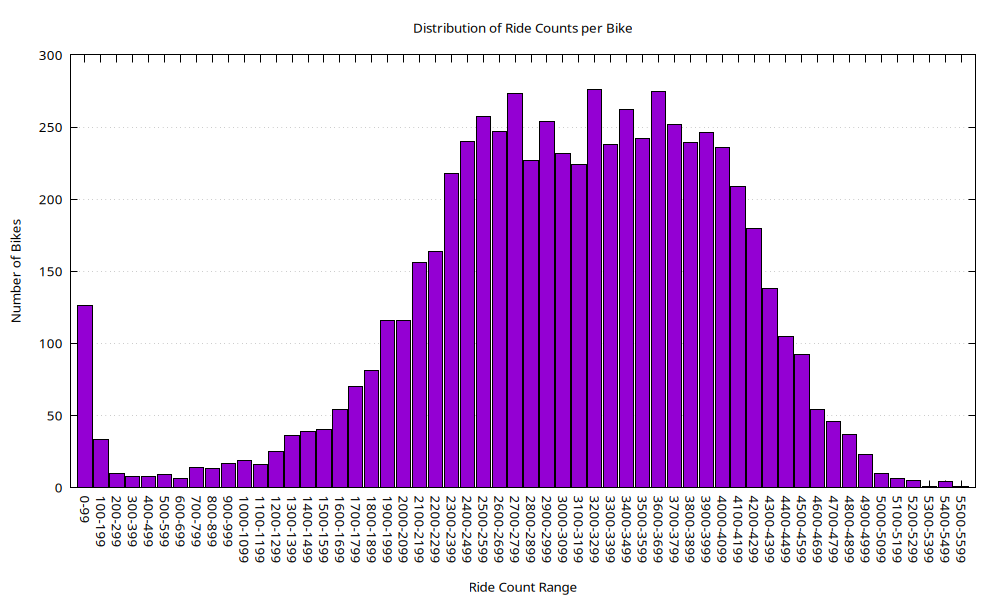
Overview
This histogram visualizes the distribution of total ride counts per bike, grouped into buckets of 100 rides each. It provides insight into how evenly or unevenly individual bikes are used over the dataset’s timespan.
Axes
- X-Axis (Ride Count Range):
- Labeled in bins of 100 rides (e.g.,
0-99,100-199, …,5500-5599). - Represents the total number of rides associated with each bike.
- Labeled in bins of 100 rides (e.g.,
- Y-Axis (Number of Bikes):
- Indicates how many bikes fall within each ride count range.
- Peaks near 300 bikes in the most frequently occurring bins.
Visual Elements
- Bars:
- Colored purple with black borders.
- Uniform width, covering each 100-ride range.
- Distribution forms a roughly symmetric bell-shaped curve centered around the
2700–3499range.
Observations
- Low-end Outliers:
- A noticeable spike in the
0–99bin (~130 bikes), suggesting a set of bikes with extremely limited or no use. - May include stolen, damaged, or new bikes added near the end of the data collection period.
- A noticeable spike in the
- Core Distribution:
- The majority of bikes (~200–280 per bin) fall between
2200–3999rides. - Indicates typical usage patterns and operational consistency.
- The majority of bikes (~200–280 per bin) fall between
- High-end Tail:
- Usage drops off steadily after ~4000 rides per bike.
- Very few bikes exceed 5000 rides.
Interpretation
- The chart implies a relatively well-utilized fleet with a normal distribution centered around ~3000 rides per bike.
- The left-side spike at
0–99highlights potential outliers worth investigating:- Underused bikes,
- Possible malfunctions,
- Seasonal deployments,
- Recent fleet additions.
- The right tail shows some high-mileage bikes that may be candidates for maintenance or replacement soon.
Use Case
This visualization is valuable for: - Fleet maintenance planning (identify overused/underused bikes), - Lifecycle analysis (detect uneven distribution of wear), - Deployment strategy (optimize rotation or redistribution).
Data Sources
rides table in SQLite, queried for bike usage counts grouped by bike_id.
SQL Query to Produce Aggregated Data
.headers on
.mode csv
.output bike_ride_buckets.csv
WITH bucketed AS (
  SELECT
    (ride_count / 100) * 100 AS bucket_start,
    COUNT(*) AS bike_count
  FROM (
    SELECT bike_id, COUNT(*) AS ride_count
    FROM rides
    WHERE bike_id IS NOT NULL
    GROUP BY bike_id
  )
  GROUP BY bucket_start
  ORDER BY bucket_start
)
SELECT
  bucket_start,
  bucket_start + 99 AS bucket_end,
  bike_count
FROM bucketed;
.output stdout
Gnuplot Script Used to Generate Chart:
set datafile separator ","
set terminal pngcairo size 1000,600 enhanced font 'Verdana,10'
set output 'bike_ride_bucket_histogram.png'

set title "Distribution of Ride Counts per Bike"
set xlabel "Ride Count Range"
set ylabel "Number of Bikes"
set style fill solid 1.0 border -1
set boxwidth 0.9
set grid ytics
unset key
set xtics rotate by -45

# Format x-tics with the bucket label, like "0–99"
plot 'bike_ride_buckets.csv' using ($0):3:xtic(strcol(1)."-".strcol(2)) with boxes
🔄 Route Asymmetry
Where paths are not balanced in both directions by user type.
Top 20 Most Asymmetric Paths
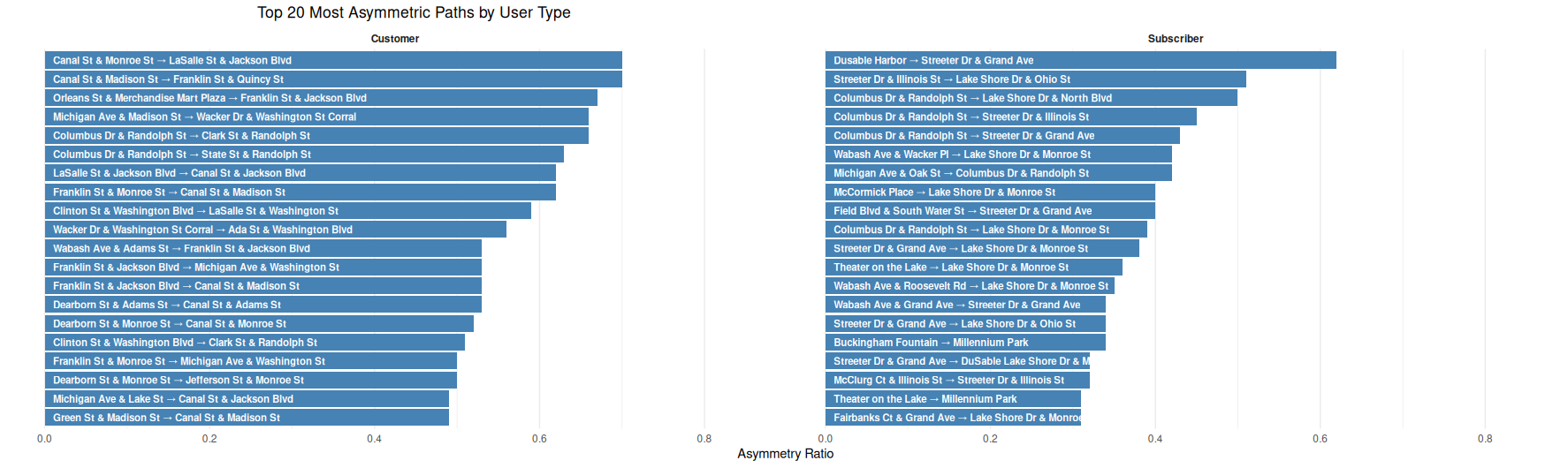
Top 20 Most Asymmetric Paths by User Type
This side-by-side horizontal bar chart identifies the 20 most directionally imbalanced ride paths (i.e., asymmetric) for each user type — customers on the left and subscribers on the right.
What is Asymmetry?
The asymmetry ratio is defined as: > rides in one direction / total rides in both directions
Values closer to 1.0 indicate strong directional bias.
Key Observations:
- Customer paths tend to involve routes to and from major downtown hubs like Canal St, Clinton St, and Wacker Dr — possibly reflecting less predictable, one-way tourist or ad hoc travel.
- Subscriber paths are more concentrated near recreational or scenic areas like Columbus Dr, Streeter Dr, and Lake Shore Dr, hinting at commuting or habitual use involving these corridors.
- Subscribers’ top asymmetric paths skew toward locations like Millennium Park, McCormick Place, and DuSable Harbor, supporting recreational or last-mile transit interpretations.
- Despite both groups sharing some geographical overlap, their most imbalanced paths differ significantly in direction and endpoint distribution.
This visualization helps highlight the behavioral contrast in directional ride patterns between user types.
Top 20 Most Asymmetric Paths by User Type

📝 Image Notes
Title: Top 20 Most Asymmetric Paths by User Type X-Axis: Asymmetry Ratio (from 0.0 to ~0.7) Panels: Two side-by-side bar charts
- Left panel: Top asymmetric paths for Customers
- Right panel: Top asymmetric paths for Subscribers
Interpretation
- Asymmetry Ratio
- A value approaching 1 indicates heavy one-way usage between a pair of stations. Rides commonly occur in one direction but rarely the other.
- Customer Patterns
- Concentrated near transit stations and central business districts. Reflect unidirectional use, possibly due to nearby public transit hubs, tourism drop-offs, or lack of return trips.
- Subscriber Patterns
- Focus on lakefront access (e.g., Streeter Dr, Lake Shore Dr) and commuter endpoints. Suggest consistent commuting flows where riders may use other transportation methods for return trips (e.g., walking or transit).
- Contrast
- While customers show asymmetry in the urban core, subscribers show it around recreational or edge areas.
🖥️ ScreenShots
Divvy Stations in QGIS
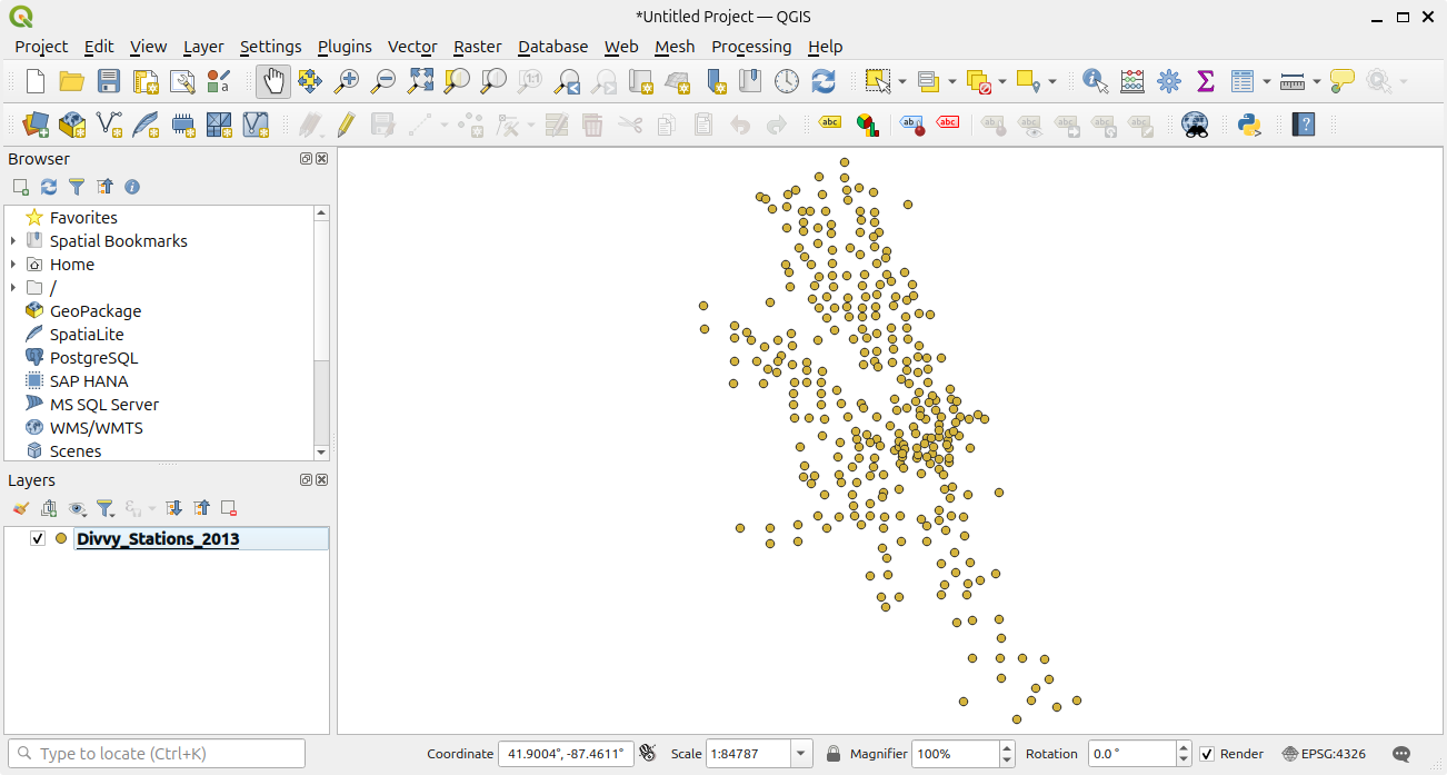
This is a screen shot of the Divvy Stations plotted in QGIS. This was found in Divvy_Stations_2013.shp.zip which was included in the Divvy_Stations_Trips_2013.zip file.
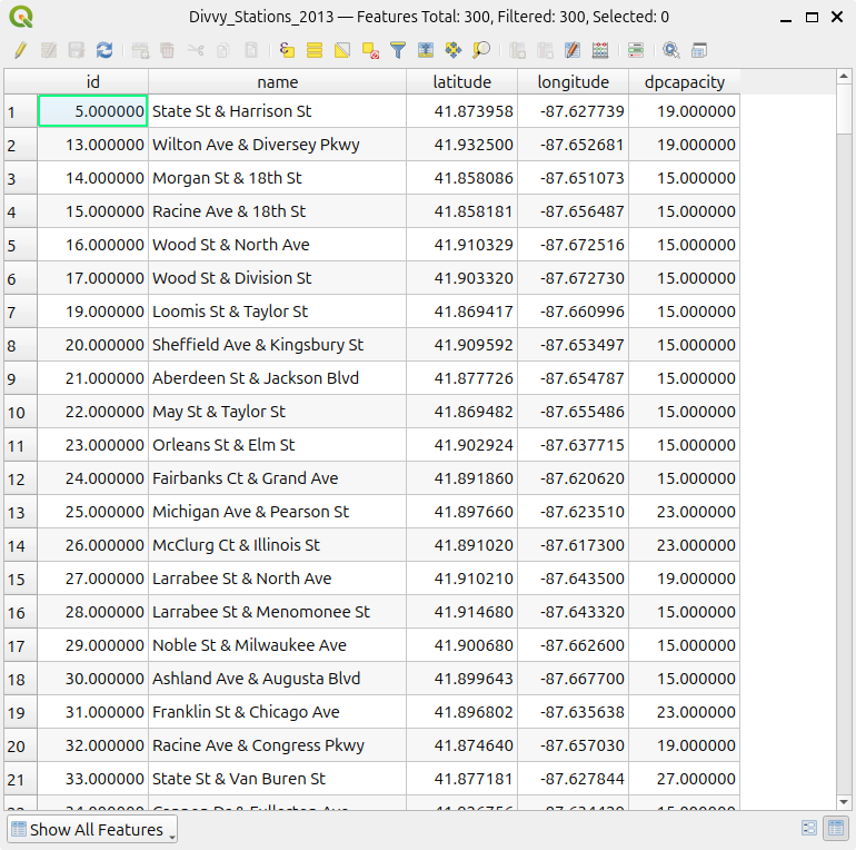
Divvy Stations Table
This is a screen shot of the Divvy_Stations_2013 table taken from QGIS